Copy Koffie – Webdesign
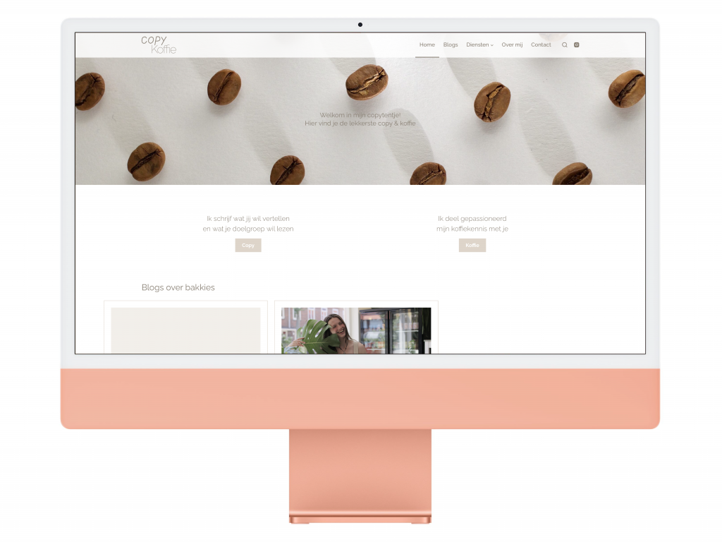
Website design has always been something I liked to do, the thing I didn’t like about it was building the it. So when my sister asked me to help er make a website for her new business, I was hesitant. Luckily we pressed on and made an amazing Copy Koffie Website Design.
Focus op tekst
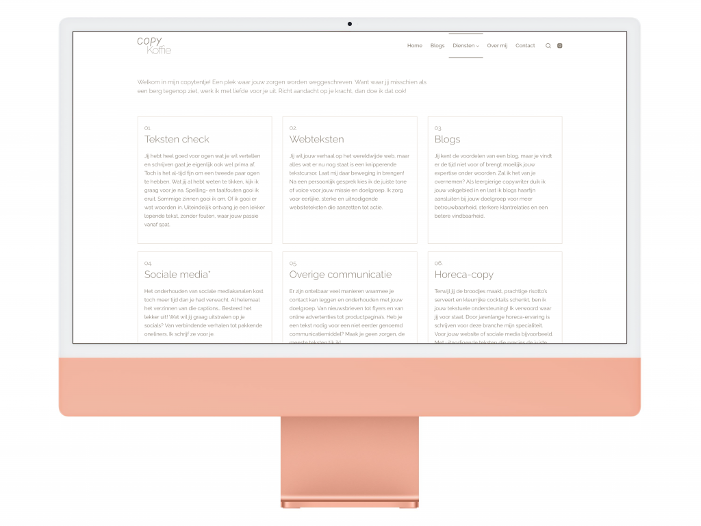
Rebecca wanted a website that focuses on text. As a freelance copywriter this is where peoples focus should go. Thats why we picked out the best font, luckily she had already been working with some great fonts on her instagram pagina. The font we picked is Raleway. This font has great variety in boldness, making it very useful in any situation, from plane text to titles.
Next to a great font, being text centric means that the rest of the website needs to be calm and easy on the eyes. For this we needed to find a good WordPress thema kiezen.
Het Copy Koffie thema

There was a lot of creative freedom in this project. As long as I stayed within the style of Copy Koffie. There are a few things that Rebecca wanted to see in the website, one being a great banner. We found a WordPress theme that works perfectly in every way we needed called Blocksy. This is a simple template that allows customisation on everything we needed, like the beautiful menubar and banner.
Website kleuren en stijl
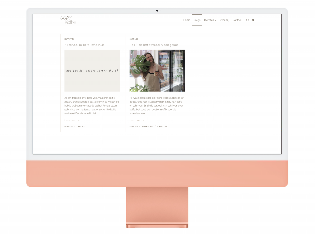
Rebecca was already quite active on Instagram at the time, on which she developed a clear style. Together we figured out colour codes and usage of those. After that the website also needed a good logonodig. Daarom hebben we een super woord- en lettermerk ontwikkeld.
Since ‘simplicity’ is a good way to describe Rebecca’s style, we kept the website simple and calm. Together we developed a beautiful design language throughout the website, with simple buttons and cards.
Interactie en blog
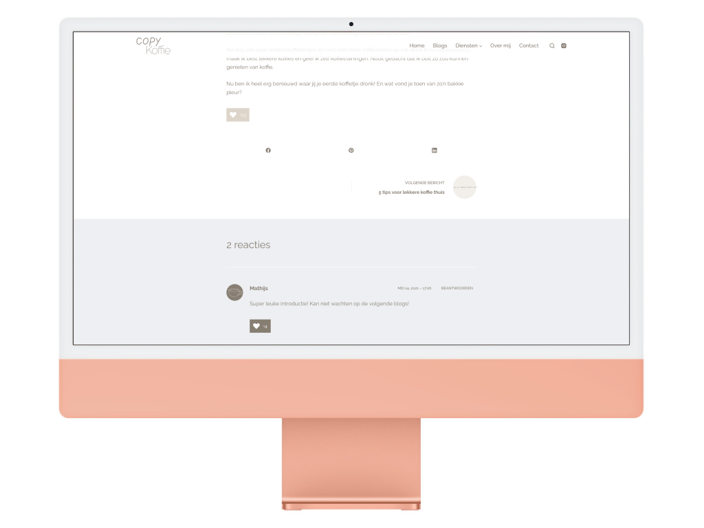
Rebecca has been writing about coffee for a while now. Mostly on instagram captions where people are always eager to comment and like. That’s why I found it important to have similar interaction on her blog. Visitors can now like a blog without logging in and comment within a few seconds. In the end it turned out perfectly, even with a custom profile picture for people who don’t have one.
Geweldig resultaat
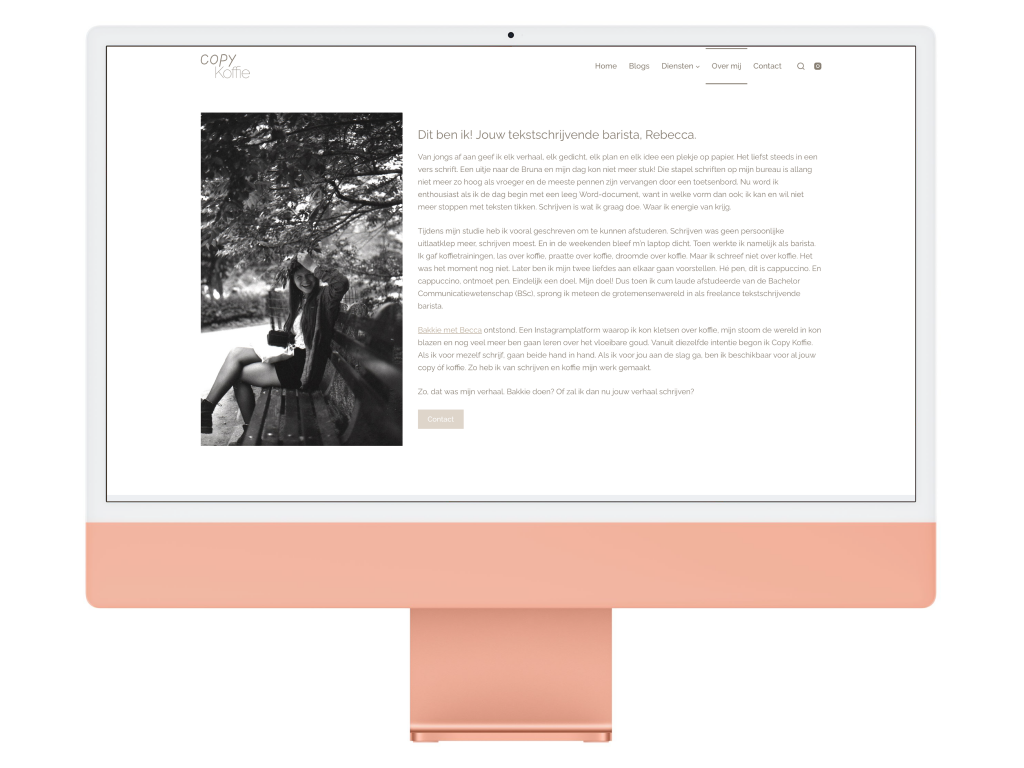
De Copy Koffie Website design turned out amazing. It’s everything Rebecca visualized for her own website. This project also gave me the confidence to work on more simple websites, like my own!

