Marcelis – Logo Design
The singer Stongwriter by the name ‘Marcelis’ came to me with the opportunity to create a logo for him. The owner of Buzz referred him to me.
Marcelis’ website is getting an overhauled, this begs for a new logo. That is where I come in to create the Marcelis Logo design.
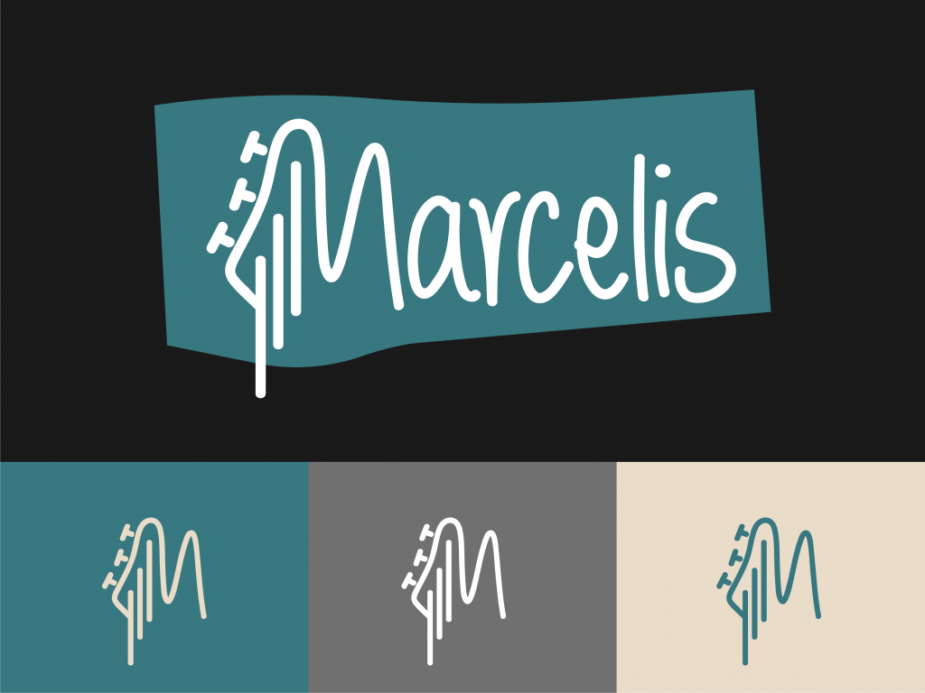
Marcelis already had a logo designed by a design student. Unfortunately it wasn’t what the singer wants. Despite this Marcelis also couldn’t say what he did want in the logo. So we started by looking at the current logo, identifying all the things he likes. Besides that we looked at logo’s from other singer songwriters. Creating a list of logo’s that would fit in with Marcelis.
Round 1
Font exploration
The things that jumped out where that the logo needed to be personal, for this reason handwritten is preferred. The M designed as a guitar head, an element from his old logo, stayed.
With this information, the first round of exploration is font searching.
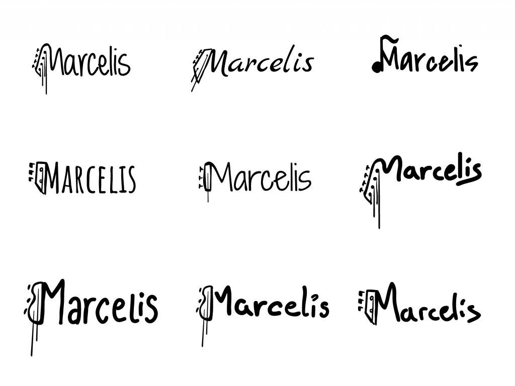
To give the client an idea of how the font can be used, both the font on its own, and the image shown above got presented. The font with a sketch of the Guitar M. These sketches also let the client state more clearly what direction of Guitar M he likes. With the chosen fonts and feedback on the Guitar Head I got to work.
Round 2
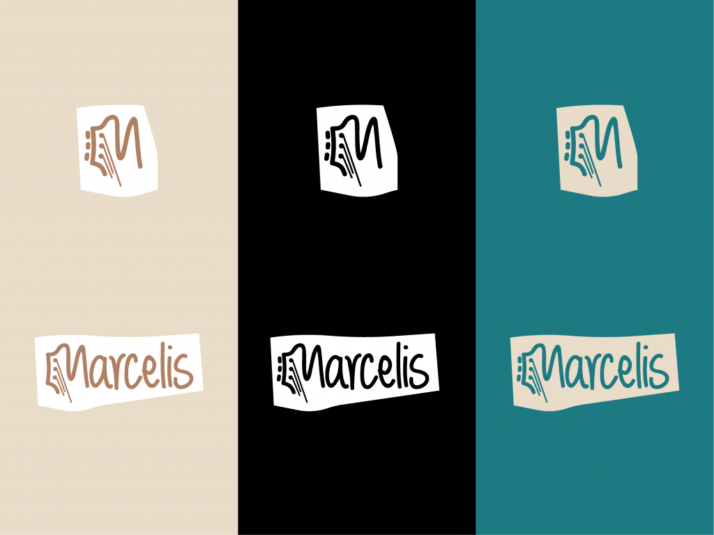
Font Definition
In the next round the logo’s get put into the colours used in the website of Marcelis. This gives the client a good view of the logo. The M Guitar Head was made to look more like the guitar Marcelis uses. Additionally a bold background box got created to incase the logo into.
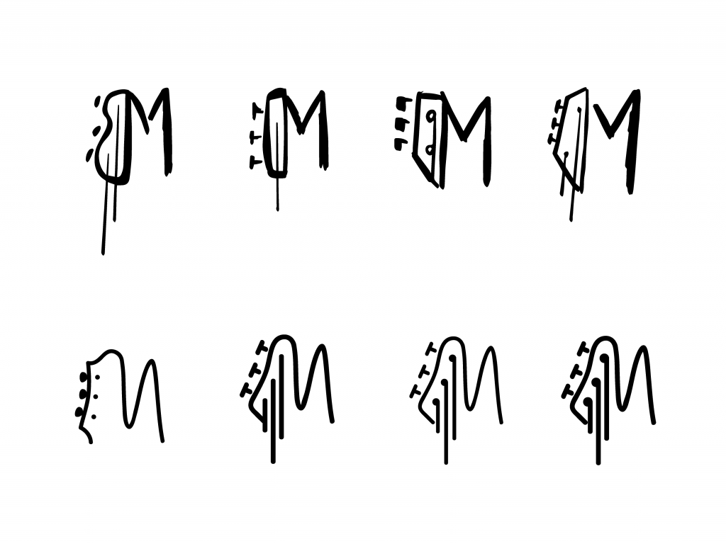
Looking at the Guitar Head in the M made us decide to try a few more different options. The options didn’t necessarily had to look like his guitar at this point.
Round 3
Icon Exploration
Finally coming to the stage where there is a more clear image of the final icon. A few playful and some more stylised icons are shown. Some of the icons don’t use the font that had already been chosen, but these could be styled into that font.
Round 4
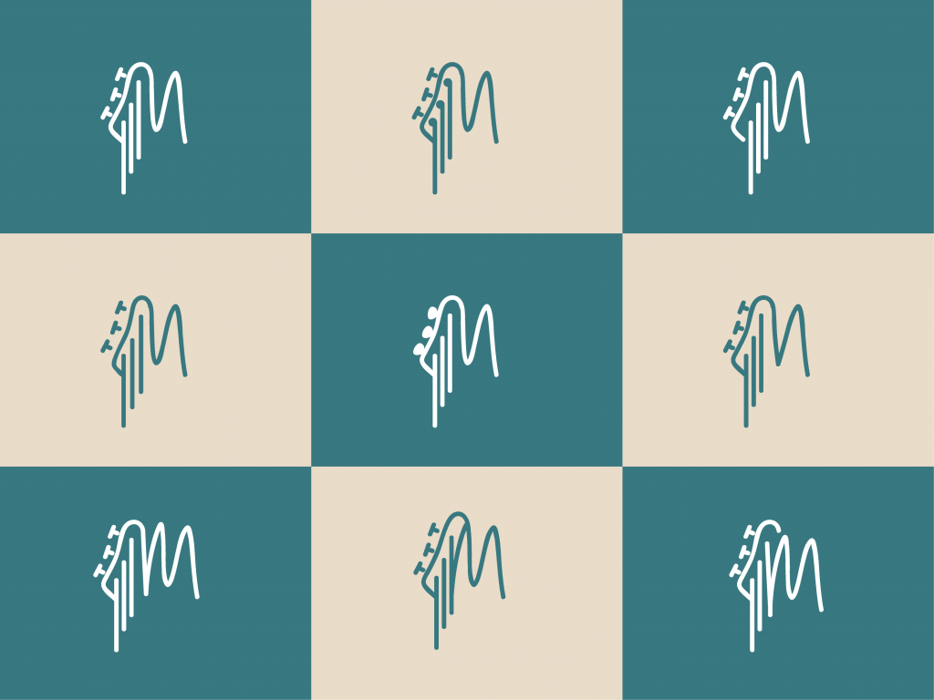
Icon Refinement
Having picked a font, font weight and icon. The only thing left was to refine the icon to make it absolutely perfect. Because of the complex shape of the icon, most of the refinements where in making the icon simpler. Things such as removing details and giving lines more space helped with this process.
Lastly we played with the sizes of the guitar strings, making them go from small to big, big to small, etc.
Final Product
With all the amazing feedback a beautiful logo has been created. The logo can be used in 30 different varieties. Differing in colour, icon or word-mark. And having an incased and non incased version. Therefore the logo will fit in anywhere Marcelis needs to use it.
I am very proud of this log and the process of creating it.

